I don’t believe that I have been this excited over
a makeup launch by MAC since their release of the Hello Kitty
Collection(s). That was one collection
that I vowed to purchase at least one of every makeup item that was released in
the “Mild”, “Wild”, and “Kouture” Hello Kitty collections. I nearly accomplished that save only 3 items
that I passed on purchasing. This
Archie’s Girls collection brought back a similar nostalgic feeling. It took me back to the playground, where my 4th
grade bff first introduced me to Archie’s comics and I was hooked ever
since. Those feelings and memories made
me nearly lose my mind and attempt to purchase everything that was released in
this collection too, but then reality and reason took over. After much deliberation and thought about the
makeup I already own, my selection was drastically reduced (for now).
Let’s start with the lip products…
There were six shades of lipstick released with
this collection, three of which featured Betty on the packaging, and the other three
featured Veronica.
The Lipsticks
From the Betty side of the collection:
“Girl Next Door” (a vivid blue
pink)
“Betty Bright” (a light vibrant
peach)
“Oh, Oh, Oh” (a sheer brown plum)
I only walked away with Betty Bright. Although “Girl Next Door” and “Oh, Oh, Oh”
are beautiful lipsticks, with the approach of spring and summer, “Betty Bright”
made me yearn for the warmth of the sun and to be drenched in its rays. “Girl Next Door” seemed very reminiscent of MAC’s
“Viva Glam Nicki 2” and “Budding Love” lipsticks. Although these shades are not remotely dupes
for each other, I felt I could achieve my candy colored purple with the shade
that I own, “Budding Love”, which was a limited edition shade released with the
Chenman collection. “Oh, Oh, Oh” seemed
like a unique shade that would serve more as a neutral on me, rather than a
burst of color for my lips. That brings
me to “Betty Bright”…ahhhh…the wonder of this lipstick. In the tube, the color reminded me of the
original “Viva Glam Nicki” or “Vegas Volt”.
I was surprised at how different the shades actually were and I have to
say that based on the promo pics for “Betty Bright” I was really expecting
something else. This color has the
potential to be very subdued or neon/punchy on the lips, depending on how it is
applied.
 |
| Pictured Left to Right: Kiss & Don't Tell, Betty Bright, and Strawberry Malt. |
 |
| Betty Bright |
 |
| Comparison swatches from Left to Right: Viva Glam Nicki, Betty Bright, and Vegas Volt. Photographed with flash. |
 |
| Comparison swatches from Left to Right: Viva Glam Nicki, Betty Bright, and Vegas Volt. Photographed without flash. |
I wasn’t able to capture Betty Bright and do it “justice”,
so I stuck to the dreaded skin swatches.
From the Veronica side of the collection:
“Daddy’s
Little Girl” (a midtone pink violet)
“Ronnie
Red” (a bright red)
“Boyfriend
Stealer” (a deep blackened plum)
 |
| Comaprison swatches of MAC's Petals and Peacocks vs. Daddy's Little Girl |
As I mentioned in a previous post, the Veronica
side of the collection really sucked me in (and I’m ashamed to post this
because I’m totally team Betty). I felt
the colors would be something that I could easily pull off, without question,
but unfortunately, I didn’t walk away with anything from the Veronica
lipsticks. I knew from the beginning
that “Boyfriend Stealer” was a color that I was going to pass on purchasing, so
I gave “Ronnie Red” and “Daddy’s Little Girl” my attention. “Daddy’s Little Girl” seemed very reminiscent
of “Petals and Peacocks” (from the Liberty of London collection). When I swatched the two colors, side-by-side,
I wasn’t off the mark with my intuition.
In terms of color payoff, on me, the colors were an exact match. In terms of finish, “Daddy’s Little Girl” was
definitely more opaque and creamy”. That
alone, was not enough for me to purchase the lipstick. “Ronnie Red”…what can I say about this color
other than WHY DON’T I HAVE IT?!?!?!?!?!?!?!?! By the time I got around to going to the MAC
counter, this was the only lip product (from Archie’s Girls) that was sold
out. The weekend of the in store launch,
I had to travel out of town on a family emergency. I made an appointment with MAC to attend the
next event (which was held the following weekend) and that was too late for me
and “Ronnie Red”. It’s not as though I
don’t have any reds in my collection, but I was looking forward to adding this
one. How could I possibly pass up a
matte lipstick with all the promises of still being moisturizing? The absence of this color has sent my life
into a downward spiral. I have been
grief-stricken. Okay…maybe I’m
exaggerating a little bit, but I am extremely bummed about missing out on this
color, but I'm holding out for a miracle that we will eventually be together.
The Lipglasses
From the Betty side of the collection:
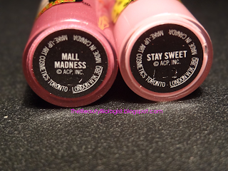
“Stay
Sweet” (a light lavender pink)
“Kiss
& Don’t Tell” (a bright coral)
”Summer
Sweatheart” (a light peach)
From the lipglasses on the Betty side of the
collection, I only walked away with “Kiss & Don’t Tell” (update: and "Stay Sweet"). From the first time I swatched this color on
my hand, I was smitten. This color looks
very fun and youthful. Although the
other two that were released are very beautiful, this one was the standout for
me. It’s a perfect match for the “Betty
Bright” lipstick. This looks like a great
color that could be either worn alone or accompany the “Betty Bright” lipstick. This might be one color that I actually need
a back-up of because I can totally see myself wearing it often.
 |
| Featured from Left to Right: Kiss & Don't Tell, Betty Bright, and Strawberry Madness |
 |
| Kiss & Don't Tell |
 |
| From Left to Right: Betty Bright and Kiss & Don't Tell (with flash) |
 |
| From Left to Right: Betty Bright and Kiss & Don't Tell (without flash) |
From the Veronica side of the collection:
“Mall
Madness” (a midtone pink violet)
“Strawberry
Malt” (a bright red)
“Feelin’
So Good” (a deep blackened plum)
In case you didn’t notice, MAC’s descriptions for
these lipglasses match those of the lipsticks from the Veronica line. The only lipglass I walked away with was “Strawberry
Malt” (update: and Mall Madness). I have to admit that my
intentions of purchasing this lipglass was to be able to pair it with the
“Ronnie Red” lipstick (I’m still bummed).
I knew that I was going to pass on purchasing “Feelin’ So Good”, but I
did give a second third look at “Mall Madness”.
At first glance, this lipglass reminded me of “Sweet Strawberry”
(released with the Hello Kitty Collection) and “Fierce and Fabulous” (released
with the Style Warrior collection) and boy was I wrong. “Mall Madness” is an extremely opaque and
gorgeous color, but without the desire to purchase “Daddy’s Little Girl”
lipstick, the desire to purchase this one diminished as well (update: it totally didn't because now, I have it).
 |
| Strawberry Malt |
 |
| Strawberry Malt on the lips |
The Blushes
There were two blushes released with this
collection, one for Betty and one for Veronica.
Betty’s blush, “Cream Soda” was appropriately named. This color is described as a “light neutral
coral”. I immediately thought of “Fun
and Games” released with the Hello Kitty collection, but these colors show up
nothing alike. I thought that “Cream
Soda” would be one of those colors that married with your skintone and
depending on your shade, it would be something different. I posted a heavy swatch of the color on my
hand. When I finally tried the color on,
I didn’t really notice it showing up.
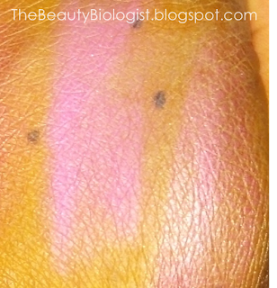
Veronica’s shade of blush is called “Prom Princess” and is described as
a “midtone violet pink”. This seems to
be the hot seller of the two shades. I
made the trek to MAC with a couple of colors I already owned in tow. “Prom Princess” gave off a nice sheen, but it
swatched similarly to “Amazon Princess” (from the Wonder Woman
collection). I would hardly call these
two colors dupes for each other.
 |
| MAC's Amazon Princess (right) vs Prom Princess (left) |
 |
Comparison of face/cheek products.
Left Image: Top Row features Betty's products in Flatter Me Pearlmatte and Cream Soda Blush
Bottom Row features MAC's Mighty Aphrodite and Fun and Games Blush
Right Image: Top Row features Veronica's products in Veronica's Blush and Prom Princess Blush
Bottom Row fearures MAC's Amazon Princess and On A Mission Blush |
The Face Powders
MAC’s Archie’s Girls collection featured two face
powders and at the time of my original post, I only had the opportunity to play
with one of them. I purchased both of
the face powders. The thing that I find
most intriguing about these powders is that the brightly colored hearts are
reported to continue thought the compact, unlike previous face powders MAC has
released that only featured an “overspray”.
I haven’t dug through the powder to find out if this is true, but I am
really hoping that the color is consistent through the powder.
Betty’s powder, “Flatter Me”, is described as a
golden peach with coral hearts. It gives
off a nice, warm-toned sheen and looks like it will make a great
highlighter. Veronica’s powder,
“Veronica’s Blush”, is described as a “silvery pink base with deep pink hearts”. I think the description for this color is
pretty accurate. It gives a very
cool-toned sheen and I think this could also serve as a good highlighter.
What makes me apprehensive about using this product
is damaging the powders. When the Hello
Kitty collection launched, I purchased the beauty powder in “Tahitian Sand”. The Hello Kitty beauty powders had the Hello
Kitty head embossed in the powder. The
more you used the powder, the more her face would become worn down. Without truly knowing whether or not the
hearts go all the way through the Archie’s’ Girls powders, there is the
potential of losing the beautiful pink and coral hearts and I’m not convinced
that I’m willing to part with them.
 |
| Veronica's Blush (right) and Flatter Me (left) |
 |
| Veronica's Blush (right) and Flatter Me (left) |
 |
| Flatter Me Pearlmatte Face powder |
 |
| Flatter Me Pearlmatte powder: Swatched together (left), heart detail (middle), powder (right) with camera flash |
 |
| Flatter Me Pearlmatte powder: Swatched together (left), heart detail (middle), powder (right) without camera flash |
 |
| Veronica's Blush Pearlmatte Face powder |
 |
| Veronica's Blush Pearlmatte powder: Swatched together (left), heart detail (middle), powder (right) with camera flash |
 |
| Veronica's Blush Pearlmatte powder: Swatched together (left), heart detail (middle), powder (right) without camera flash |
The Pigments
There were four pigments released with this
collection, two from Betty’s side and two from Veronica’s. Pigments are a bit tricky for me. The only pigments that I own are from back
when mad sold 7.5g jars for $19. MAC has
since reduced the size of their pigments to 4.5g and the price for this
collection is $23 ea. Even though there
is a difference in the price and amount of product you receive, my only
reservation is that I don’t wear the pigments I already own. I was very inspired by the pigments released
with this collection. I thought “Cheers
My Dear” pigment was going to look similar to “Milk” pigment (released with
MAC’s Hello Kitty collection), but they are not the same. I especially liked Veronica’s dark and edgy
pigments, but overall I think that Betty’s and Veronica’s pigments would work
well together.
 |
Comparison swatches of eyeliners and pigment
Left Image, Top Row: Pearlglide eyeliners in Rave and Black Russian
Left Image, Bottom Row: Pearlglide eyeliners in Designer Purple and Black Swan
Right Image: Milk Pigment (left) and Cheers My Dear Pigment (right) |
The Eyeliners
This was another debate I had with myself. There were four pearlglide eyeliners that
were released, two for Betty and two for Veronica. I purchased two pearlglide eyeliners in the
past, in “Black Russian” and “Rave”.
When I swatched these two eyeliners next to “Black Swan” and “Designer
Purple”, from the Archie’s Girls collection, the colors appeared to be
identical. “Black Swan” and “Designer
Purple” were creamier and easier to apply, but again the colors I already own
don’t get any wear.
The Eyeshadows
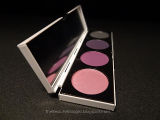
There were two eyeshadow quads released with this
collection, one for Betty and one for Veronica.
I have not yet purchased these quads, but have added them to my list of
must haves, so I’ll save my virtual soliloquy on them for another post.
The Archie’s Girls collection also features two
mascaras, four nail polishes, and a host of accessories. Mascaras seem to have a shorter shelf life
than most other makeup items. Once you
open them, they begin to dry out and when that day comes, I can’t see myself
parting with such cute packaging. The
nail polishes from this collection look dreamy.
I haven’t swatched any of them, but I have noticed that some retailers
are carrying the shades with the actual Betty and Veronica packaging, unlike
the MAC website or my local counter.
From reports that I’ve seen on other sites, it
looks like MAC will launch this collection internationally, next week. For those of you who get the opportunity to
purchase “Ronnie Red”, think of me and know that I am crying inside. I am interested in seeing the posts and the
looks that are created with these products.


